BANA6043: SAS X-Y Analysis: Scatter Plots
Matt Risley
Week 2 Lecture Series
1 X-Y Analysis Intro
Comparing two variables is a simple and intuitive way to evaluate possible relationships among them. I refer to this as X-Y analysis. It’s also referred to as bivariate analysis.
X-Y analysis can include:
- scatter plots
- correlation matrices
- regression (we will cover this later)
2 Diamonds Data
Our analysis in this lecture will rely on the diamonds dataset, which is an R dataset included in the ggplot2 package.
The R document on the data set can be found here.
The dataset includes features of 50,000+ diamonds, including price, carat, cut, color, and clarity.
Below is the R code that outputs the diamonds data set. Then, we’ll import it into SAS for analysis.
###install ggplot2 package
install.packages('ggplot2')
#only needs to be done once
###load ggplot2 package
library(ggplot2)
###load diamonds dataset & pull R doc
data('diamonds')
help(diamonds)
head(diamonds) #first 6 rows## # A tibble: 6 x 10
## carat cut color clarity depth table price x y z
## <dbl> <ord> <ord> <ord> <dbl> <dbl> <int> <dbl> <dbl> <dbl>
## 1 0.23 Ideal E SI2 61.5 55 326 3.95 3.98 2.43
## 2 0.21 Premium E SI1 59.8 61 326 3.89 3.84 2.31
## 3 0.23 Good E VS1 56.9 65 327 4.05 4.07 2.31
## 4 0.290 Premium I VS2 62.4 58 334 4.2 4.23 2.63
## 5 0.31 Good J SI2 63.3 58 335 4.34 4.35 2.75
## 6 0.24 Very Good J VVS2 62.8 57 336 3.94 3.96 2.48nrow(diamonds) #number of rows## [1] 53940#output to my desktop
write.csv(diamonds, "C:/users/t530/desktop/diamonds.csv")3 Understanding the Data
For now, we want to explore the relationship between carat and price. Generally, larger carat diamonds are more expensive.
We’ll explore the data as part of In-Class Assignment 2.
4 Scatter Plot with SGPLOT
I am fond of saying that, by themselves, numbers are meaningless. This may be overexaggeration, but the point is that they rarely tell the full story. Data visualization is key to forming insights.
Scatter plots are a basic analytical tool to evaluate possible relationships among variables through visual means.
Let’s plot price against carat size (i.e., price on the y-axis and carat on the x-axis). Scatter plots are requested in SAS with a SCATTER statment in a PROC SGPLOT. SG stands for “Statistical Graphics”.
Click here for the PROC SGPLOT documentation.
Click here for the SCATTER statement documentation
Note: you need to use ODS graphics with PROC SGPLOT.
ods graphics on;
proc sgplot data=mrrlib.diamonds;
    scatter x=carat y=price;
    title 'Plot of Price by Carat Size';
run;
ods graphics off;
The PROC explained:
- We use the SCATTER statement, assigning carat to the x-axis and price to the y-axis. The x and y arguments are required. You can switch their order, however.
- We use the global title statement. Because it’s global, we can move outside of the PROC if we wanted.
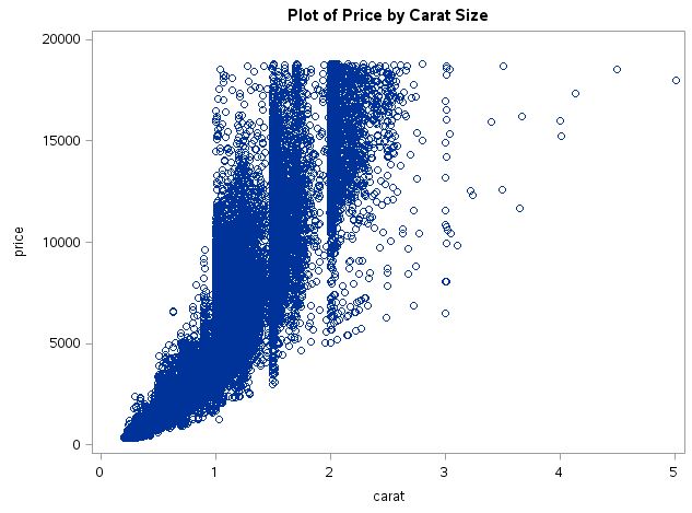
Observations:
- It appears that as carat size increases, the price of the diamond increases.
- It also appears that this relationship is somewhat non-linear. A linear relationship is one that follows a straight line.
- Because there are so many observations (over 50k), the visualization suffers from over-plotting. This means that points are so stacked on top of one another that it is difficult to understand the density of data.
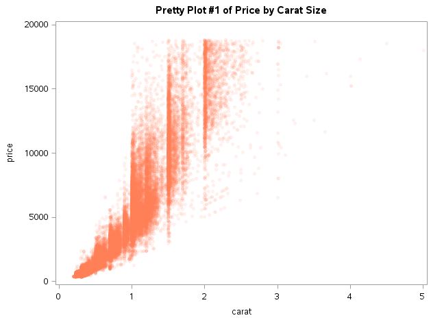
5 Scatter Plot with Options
5.1 Remove Overplotting
Transparent colors are a great tool for data visualization when you have large-scale data. It aids in showing the distribution of data.
You can also change the marker type, size, and color in order to promote readability of the visualization.
ods graphics on;
proc sgplot data=mrrlib.diamonds;
    scatter x=carat y=price /
            transparency = 0.9
            markerattrs=(symbol=circlefilled
                         size=5
                         color=coral);
    title 'Pretty Plot #1 of Price by Carat Size';
run;
ods graphics off;
The code does the following:
/denotes that what follows are options for the scatter statementtransparencychanges the transparency of the graphed elements. This is a value between 0 (no transparency) and 1.0 (complete transparency). I chose 0.9 by fiddling around with a few possible values.markerattrs=(symbol=circlefilled size=5 color=coral)option to change the marker symbol, size and color. Note that these are sub-options within the ``markerattrsoption. That’s why we use parentheses in order to call them.- There are 24 possible markers. See the possible marker symbols here.
- Size is measured in pixels by default. You can change this with another option (to inches, for example).
- I use a pre-defined SAS color, called “coral”. SAS has a lot of pre-defined colors that are good for visualization. See the SAS pre-defined colors here. R has a lot of the same ones.
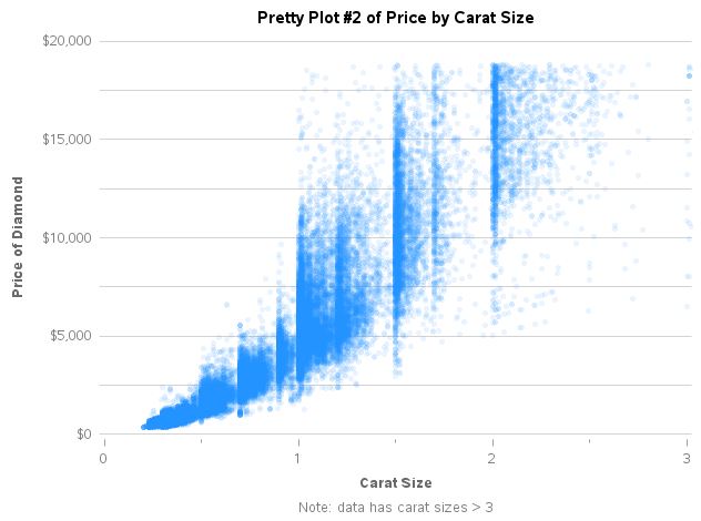
5.2 Change Plot Format
SAS’s default labels are usually pretty readable. However, imagine that your variable name for “carat” were “crt”. Or, imagine you need more tick marks than the ones supplied by default by SAS.
ods graphics on;
proc sgplot data=mrrlib.diamonds noborder;
    scatter x=carat y=price /
            transparency = 0.9
            markerattrs=(symbol=circlefilled
                         size=5
                         color=dodgerblue);

    title color=black 'Pretty Plot #2 of Price by Carat Size';
    footnote  color=gray 'Note: data has carat sizes > 3';

    xaxis
        label="Carat Size"
        labelattrs=(color=dimgray weight=bold)
        values = (0 1 2 3)
        valueattrs=(color=gray)
        minor
        display=(noline);

    yaxis
        label="Price of Diamond"
        labelattrs=(color=dimgray weight=bold)
        valueattrs=(color=gray)
        grid
        gridattrs=(color=lightgray)
        minorgrid
        minorgridattrs=(color=lightgray)
        display=(noline noticks);

    format price dollar.;

run;
ods graphics off;
While the code above looks daunting, it’s more about the way that SAS works rather than anything complex. The code requests the following:
- TITLE and FOOTNOTE statements
- color must come before the text
- these are global options
- TITLE and FOOTNOTE documentation
- XAXIS and YAXIS statements
- statements are used with SG procedures
labelis the axis labellabelattrschange the label attributesvalueattrschange the attributes of the values displayed on the axisvalueschange the values on the axisminorshows minor tick marksdisplaycan suppress the axis line, tick marks, label, or valuesgridwill place gridlines at every major tick markgridattrschange the attributes of the major gridlinesminorgridandminorgridattrsare for minor gridlinesminandmax(not shown) change the minimum and maximum values on the axis- XAXIS and YAXIS documentation
- FORMAT statement
- can be used in all DATA or PROC steps
- changes the format of the data in the output
dollar.is a SAS format that displays the number as a dollar- FORMAT statement documentation
- SAS Formats
- can also use the
valuesformatoption in XAXIS or YAXIS - we will cover formats more in depth
- noborder option in PROC SGPLOT supresses the outer border of the graph
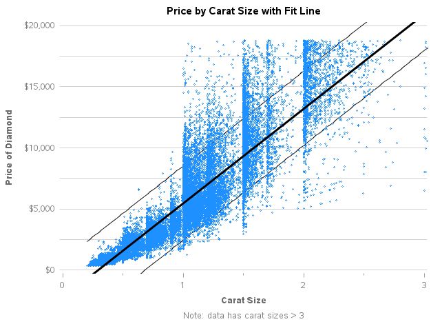
5.3 Add a Regression Fit Line
We can add a regression fit line to the plot by adding a REG statement to the PROC SGPLOT.
Here’s the REG statement documentation.
We’ll replace the SCATTER statement above with the REG statement:
ods graphics on;
proc sgplot data=mrrlib.diamonds noborder noautolegend;
    reg x=carat y=price /
            lineattrs=(color=black thickness=3)
            markerattrs=(color=dodgerblue size=3)
            cli
            cliattrs=(clilineattrs=(color=black));

    title color=black 'Price by Carat Size with Fit Line';
    footnote  color=gray 'Note: data has carat sizes > 3';

    xaxis
        label="Carat Size"
        labelattrs=(color=dimgray weight=bold)
        values = (0 1 2 3)
        valueattrs=(color=gray)
        minor
        display=(noline);

    yaxis
        label="Price of Diamond"
        labelattrs=(color=dimgray weight=bold)
        valueattrs=(color=gray)
        grid
        gridattrs=(color=lightgray)
        minorgrid
        minorgridattrs=(color=lightgray)
        display=(noline noticks)
        min=0 max=20000;

    format price dollar.;

run;
ods graphics off;
The following are the primary differences from the example above:
lineattrs=(color=black thickness=3)changes the color of the fit line to black and its thickness to 3px (3 pixels)clidisplays the Confidence Intervals around the fit line. You can specify thealphaoption to change it from the default 95% interval.cliattrs=(clilineattrs=(color=black))changes the color of the confidence limits to black. Notice that this is a sub-option to a sub-option of an option. Welcome to SAS.noautolegendas an option for PROC SGPLOT suppresses the default legend from the REG statement- I added a minimum and maximum value for the y-axis because the inclusion of the fit line changed the default values of 0 and 20,000 from the prior plotting exercises.
- I removed the transparency option and changed the marker size instead. The transparency option also changes the transparency of the fit line, which was not desired.