BANA6043: SAS X-Y Analysis: Correlation
Matt Risley
Week 2 Lecture Series
1 Correlation Intro
Correlation is an intuitive way to evaluate the strength of a linear relationship between two variables.
In general, X-Y relationships exist on a spectrum, ranging from a strong negative relationship to a strong positive relationship. In the middle, there is no relationship.
- a positive relationship between two variables means that they both increase together and that they both decrease together
- example: as the carat size of a diamond increases, the price of the diamond increases
- a negative relationship between two variables means that one decreases as the other increases or vice versa
- example: as the quantity of a good increases, its price decreases
- no relationship suggests that increases or decreases in one variable do not correspond to any increases ordecreases in the other variable. In this way they are said to be independent.
- example: US home prices and the amount of television I watch a day have no relationship
The Pearson Correlation coefficient is an easy way to gauge the existence and/or the strength of an X-Y relationship. The coefficient is a number that ranges from -1 (a perfectly negative relationship) to 1 (a perfectly positive relationship). 0 represents no linear relationship. Variables can still have relationships even with a coefficient of zero. The Wikipedia article is a pretty good introduction.
Pearson’s Correlation coefficient is also referred to as Pearson’s r.
In general:
- 0.7 < r < 1.0 or -0.7 > r > -1.0 indicates a strong linear relationship
- 0.5 < r < 0.7 or -0.5 > r > -0.7 indicates a moderate linear relationship
- 0.3 < r < 0.5 or -0.3 > r > -0.5 indicates a weak linear relationship
- -0.3 < r < 0.3 indicates no linear relationship
Note: These are guidelines. The interpretation of r rests upon the question you are trying to answer. You may need “strong evidence” of a linear relationship or just “evidence” of a linear relationship.
We will continue to rely on the diamonds dataset for this lecture.
2 PROC CORR
PROC CORR is the SAS procedure for computing correlation coefficients. Here is the SAS document.
Let’s evaluate the default output. We’ll also include the variables x, y, and z in our evaluation. These correspond to the length, width, and depth of the diamond, respectively. I add labels to these variables with a LABEL statement to improve readability of the output.
proc corr data=mrrlib.diamonds;
    var price carat x y z;
    label x="length" y="width" z="depth";
run;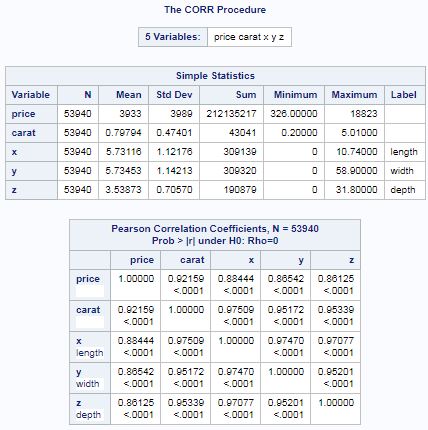
In the default output, we see: (1) simple statistics and (2) Pearson Correlation Coefficients.
The Pearson Correlation coefficients are presented in matrix form. In general, we see that price has a strong positive correlation each with carat, length, width, and depth. We can also see that carat, which represents the size of the diamond, also has a positive relationship each with length, width, and depth. All values of r are greater than 0.9.
Below the r is the p-value associated with the coefficient. If the p-value is < 0.05, we can say that the relationship is statistically signifcant. Be careful, however, because there can be statistical significance for no relationship. So, an r of -0.01 and a p-value less than 0.05 indicates that there is statistically significant evidence of no linear relationship between the two variables. It does not mean that there is a statistically significant relationship.
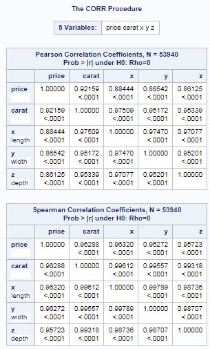
PROC CORR can provide additional correlation coefficients.
proc corr data=mrrlib.diamonds pearson spearman nosimple;
    var price carat x y z;
    label x="length" y="width" z="depth";
run;
The code above uses the PROC CORR options to request Spearman’s rank-order correlation coefficient in addition to Pearson’s. It also suppresses the simple statistics output.
3 Correlation Matrix Plots
SAS can display matrices with scatter plots as well. However, with the number of observation in the dataset, the load on SAS becomes noticeable. The below scripts each took about two minutes to run.
To run these quickly, you can specify the obs= option for the data option in the proc: data=mrrlib.diamonds(obs=1000). This will run the procedure on the first 1000 observations only.
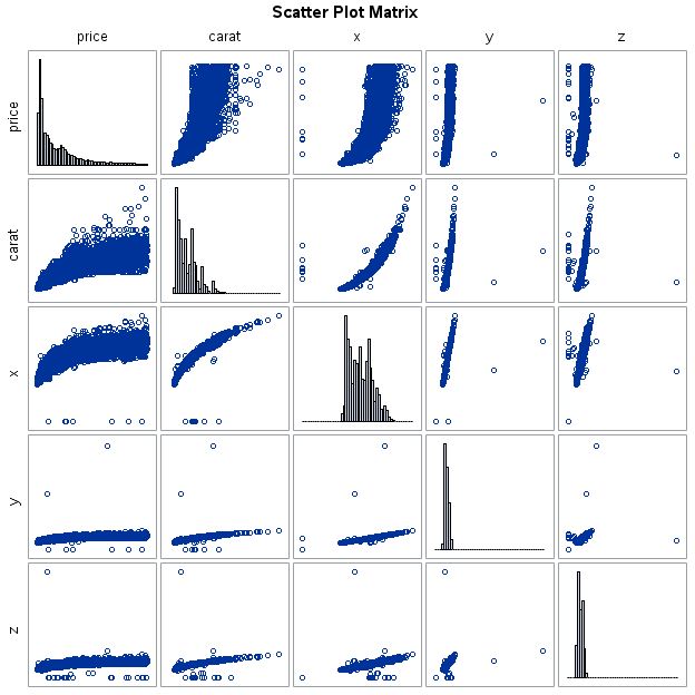
3.1 with PROC CORR
ods graphics on;

proc corr data=mrrlib.diamonds
nomiss plots=matrix(histogram) plots(maxpoints=none)
nosimple nocorr;

    var price carat x y z;

run;

ods graphics off;
The PROC CORR options explained:
nomissexcludes missing values. This is a common option on many statistical procedures.plots=matrix(histogram)requests the matrix plot with histograms on the diagonal.plots(maxpoints=none)overrides the default of 5,000. This allows the PROC to run with the many observations in the dataset.nosimplesuppresses simple statistics.nocorrsuppresses correlation statistics.
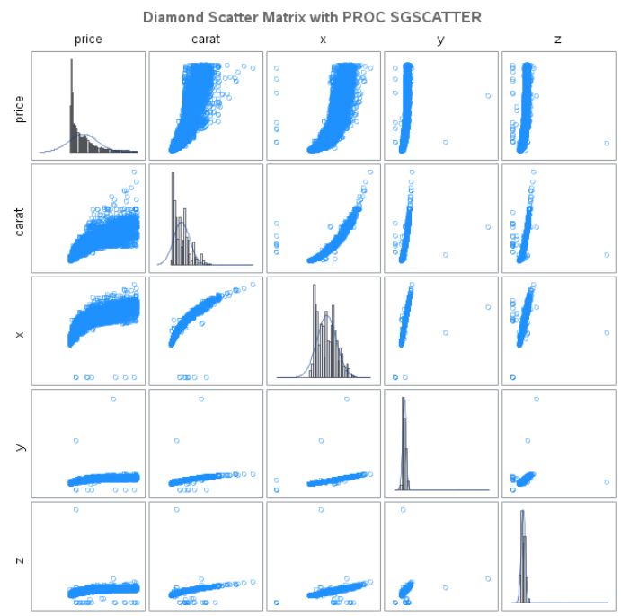
3.2 with PROC SGSCATTER
We haven’t shown this PROC, but it exists. Documentation is here. I have found it useful for generating these plots because you can better control the output.
ods graphics on;
title color=dimgray "Diamond Scatter Matrix with PROC SGSCATTER";

proc sgscatter data=mrrlib.diamonds;

    matrix price carat x y z / transparency=0.5
                               diagonal=(histogram normal)
                               markerattrs=(color=dodgerblue);

run;
ods graphics off;
The PROC explained:
matrixstatement calls the matrix plotprice carat x y zare the variables analyzed/specifies the options for the matrix statementtransparencymodifies the transparency of all plot elements (unfortunately)diagonal=(histogram normal)calls a histogram and a normal curve overlay in the diagonal of the matrix. Note: the overlay is to evaluate whether the underlying data are normal. Deviance from the curve suggests non-normal data and congruence with it suggests normal data. Only x, y, and z appear to be normally distributed.marketattrs=(color=dodgerblue)specifies that the markers are to have the predefined color ‘dodgerblue’